Objective:
The objective of this activity is to enhance your awareness of the “rule of thirds” in your photographic composition.
The Activity:
Take two photographs of the same subject, one following the rule of thirds and one that doesn’t. The rule of thirds is a very powerful and widely used compositional device and by photographing the same scene in this way you will gain a better understanding of how this rule influences the overall impact of the image. When framing your subject imagine that your frame is divided up into thirds both vertically and horizontally. When following the rule, align the subjects of the image along these grid lines and their four intersecting points.
Use these four intersecting points to place your subjects of interest. Experiment where you place your subject: you can follow the rule and still get dramatically different results simply by changing which intersecting points you decide to use. Think about what is important in the image and how you want it to be viewed and this will help you decide which intersecting points to use. It may be the direction your subject is facing, where they are going or where they have been. It may be the subject’s shadow, shape or surrounding elements that help you decide whether to place it in the upper left intersecting point or the lower right, for example. When taking the second image that does not follow the rule of thirds make sure that you completely break the rule. A good way to accomplish this is to place your subject in the direct centre, both vertically and horizontally. By making sure that you follow the rule with the first image and then completely break it with the next image you will have a far better appreciation of this rule and its advantages. As always, experiment. Take a number of images that follow the rule and a number that don’t of the same subject. By doing this, your review of the exercise will be far more beneficial in understanding its purpose.
Select the most successful pair of images, one that follows the rule and one that does not. Your images will then be loaded onto the computer and shared with the class.
Post these two images into your blog accompanied by a one-paragraph commentary of each image.
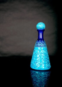
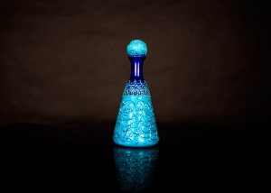
I approached this worksheet from the view of product photography for magazine or catalogue use, which I considered applicable to the subject I was photographing. Image 1 is my ‘rule of thirds’ image, image 2 is my ‘direct centre’ image. I DID process them slightly differently, in an attempt to give each image a different feel, as may be done in a commercial photography environment, consequently, they have different colour casts to them.
Image 1
Aperture F2.8
Shutter speed 1/200
ISO100 @70mm
Studio flash used for lighting.
This image has been composed in camera with the intersection between the knob style lid and the bottle placed on the upper right intersecting line. Visually, this isn’t a great image on it’s own, despite following the rule of thirds, it doesn’t appear to add much interest.
However, as a commercial image, it is much stronger, as there is now considerable negative space for the placement of text of one kind or another while still leaving the image intact. I can see this placement being particularly useful in a catalogue cover, where the strong colour contrast would draw the eye to the product, and the darker background allowing white text to pop and be of interest to the viewer.
Image 2
Aperture F2.8
Shutter speed 1/200
ISO100 @70mm
Studio flash used for lighting.
This image has the subject placed in the absolute centre of the image.. with the top and bottom of the subject being equidistant to the frame, as is the centre line of the subject.
Visually, this image is also pretty boring, there is nothing creative about a bottle in the middle of a page, and even the post production treatment of a slight vignette, a contrasting colour cast and a pop using levels hasn’t added any interest.
Placing the subject in the centre has also reduced the likelihood of any accompanying text drawing the viewers eye, making it almost impossible to draw the viewer in to see more detail, consequently, this image has a lot less worth in the commercial world.
Furthermore, the landscape orientation of a portrait style object really grates against the viewer’s eye, leaving them wondering exactly what the point is.


